")


Teen bedrooms are not just places to sleep. They are identity labs, creative studios, safe zones, and sometimes dramatic music video sets at 11 PM. That’s why DIY room decor ideas for teens matter more than ever. We’re not just decorating walls. We’re shaping how a space feels, functions, and supports daily life.
Great design balances self-expression with smart layout choices. It’s about layering lighting, mixing textures, using vertical space wisely, and choosing color palettes that energize without overwhelming. When we approach DIY projects strategically, we create rooms that grow with teens instead of feeling outdated in six months.
Think focal points, cohesive color stories, intentional storage, and soft ambient lighting. A well-designed room boosts mood, creativity, and even productivity. The goal isn’t expensive. It’s intentional. And with the right principles, even small changes can completely transform a space into something magical, functional, and totally unforgettable.
Whimsical Ceiling Wisteria Statement Corner
Okay but why have a normal corner when we can grow a literal fantasy tree indoors? This DIY idea works because it turns unused vertical space into a dramatic focal point. In design, strong vertical elements instantly draw the eye upward and make ceilings feel higher.
Start with a lightweight faux trunk structure (PVC pipe or carved foam wrapped in textured paper), then attach silk wisteria and greenery in cascading layers. Layering matters. Use the rule of depth: darkest florals closest to the base, lighter tones toward the edges for dimension. Add warm fairy lights inside the canopy for glow that feels magical, not harsh.
We’re basically hacking biophilic design here—bringing nature indoors to boost mood. Keep the surrounding walls soft and neutral so the installation doesn’t overwhelm the room. And yes, secure everything into studs or ceiling anchors. Pretty is great. Safe and pretty? Elite behavior.
Cozy Corner Hammock Plush Display
This is what happens when storage meets serotonin. A corner hammock works because it activates negative space that usually gets ignored. Corners are underused real estate in most bedrooms—design-wise, that’s wasted potential. Install wall anchors rated for weight, even if it’s “just plushies.”
We respect physics. Add soft LED string lights to create ambient lighting, which designers use to reduce harsh shadows and add emotional warmth. Keep the wall decor above simple and symmetrical so the hammock remains the focal point. The hanging photo line introduces personalization, which is key for teen rooms.
Personal elements increase emotional connection to a space. Choose a consistent color palette for plush toys to avoid visual chaos. We want curated cute, not toy avalanche energy. Bonus tip: match the rope color to wall tones for cohesion. When storage doubles as décor, we win twice.
Dreamy DIY Hanging Cloud Lights
Cloud lights are basically soft glam for ceilings. The secret sauce here is diffused lighting. Good lighting design isn’t about brightness—it’s about softness and distribution. Use paper lanterns as a base, then glue polyester stuffing evenly for that fluffy cloud effect.
Insert cool white LED bulbs to avoid heat buildup. Always LED. Safety first, vibes second. Hang at slightly different heights to create visual rhythm. Designers call this staggered elevation, and it prevents a flat, boring look. Keep the rest of the decor minimal so the clouds stay the hero piece.
If your room already has busy walls, balance it with neutral bedding. Contrast creates harmony—when one element is dramatic, the rest should breathe. Add subtle pastel tinting with spray paint for dimension. Suddenly your ceiling isn’t blank space anymore. It’s an actual sky. We love a narrative moment.
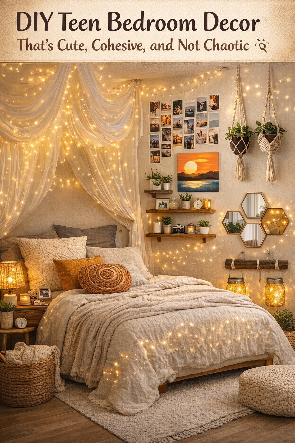
Good Vibes Only Accent Wall Moment
Text-based wall art works because words create emotional anchors. But the real magic here is composition. When stacking signs vertically, align them on a central axis to create visual order. Use soft pastel tones that complement your bedding palette.
This keeps the look cohesive instead of chaotic. The macramé piece introduces texture, and texture is non-negotiable if you want depth. Designers layer smooth (painted brick), soft (bedding), and woven (macramé) for tactile balance. Mount everything at eye level from the bed’s perspective. That’s intentional sightline planning.
Add warm fairy lights to enhance the cozy factor without overpowering the wall art. If your wall is already textured like brick, keep sign colors muted. Too many bold elements compete for attention and reduce impact. The goal is positive energy, not visual yelling. Calm, curated, and Pinterest-level intentional.
Storybook Shelf Styling With Mini Scenes
This one is for the literary main characters. Stacking books horizontally creates height variation, which designers use to build layered displays. Varying heights prevent a shelf from looking flat and lifeless. Use hardcover books with cohesive spine colors for visual harmony.
On top, place a miniature dollhouse or diorama to act as a focal sculpture. The trick is scale. Keep decor about one-third the width of the book stack for proportional balance. Add warm fairy lights around the base to frame the display and guide the eye.
Designers call this visual framing. Include small plush accents, but limit to two or three to avoid clutter. Negative space is your friend. If every inch is filled, nothing stands out. Balance whimsical items with structured book stacks for contrast. Suddenly your desk shelf isn’t storage. It’s a curated tiny universe.
Colorful Pom Pom Statement Rug
If maximalism had a cozy little sister, this would be her. A pom pom rug works because it instantly becomes the room’s focal anchor. In design, large circular rugs soften sharp furniture lines and improve spatial flow. The round shape contrasts beautifully with rectangular beds and desks, creating visual balance.
Choose 5–7 core colors pulled from bedding or wall art so the palette feels intentional, not chaotic. We’re not throwing random rainbow energy here. Use a non-slip rug pad underneath for safety and structure. Texture layering is the real MVP. The fluffy pom surface adds tactile depth, especially in rooms with wood floors.
When a space has hard surfaces, adding softness prevents it from feeling cold. Keep surrounding decor slightly muted so the rug shines. This is controlled boldness. It’s playful, yes. But it’s also strategic. Cozy meets color theory. We absolutely love a functional statement moment.
Honeycomb Floating Shelf Display Wall
Hexagon shelves are basically geometry but make it cute. The honeycomb layout works because repetition creates rhythm. Repeating shapes guide the eye and make walls feel cohesive rather than cluttered. Install them in a clustered formation with even spacing to maintain symmetry.
If spacing is off, the whole wall feels chaotic. Keep the items inside minimal and curated. Think one plush, one plant, one small figurine per shelf. This follows the rule of threes, which designers love for balanced styling. Use light wood against soft pastel walls to maintain warmth and contrast.
Add hanging plants above to extend vertical interest. Layering height keeps the wall visually dynamic instead of flat. Also, secure shelves into studs or use heavy-duty anchors. Cute is great. Secure and cute? Even better. It’s functional storage disguised as art. We call that smart decorating.
Blush Fairy Light Mirror Glow
This setup is basically soft glam but teen edition. Framing a mirror with fairy lights works because it enhances both lighting and visual scale. Mirrors reflect light, making small rooms feel bigger and brighter. Use warm white LED string lights to keep the glow flattering, not hospital-core.
Attach lights evenly around the frame to create a clean border effect. Designers use framing to define focal points, and this does exactly that. Balance the glow with soft pink textiles like rugs or pillows for cohesion. Avoid mixing too many color temperatures. Stick to warm tones for harmony.
Consistent lighting temperature keeps a room from feeling visually chaotic. Add a small bedside lamp for layered lighting. Layered lighting equals depth. Suddenly your mirror isn’t just functional. It’s ambiance central. And yes, your selfies will thank you. We love a design upgrade that doubles as main character energy.
Coastal Clay Wall Art Accents
Okay but handmade ceramic sea shapes? Adorable. These work because organic forms contrast beautifully with flat wall surfaces. Curved, natural shapes soften rigid architectural lines. When grouping wall decor, keep spacing consistent to avoid visual tension.
Designers aim for balanced asymmetry here. Not perfectly lined up, but not chaotic either. Use a limited color palette like soft pink, cream, and seafoam to maintain harmony. Too many bold tones will compete. Add subtle texture like pearls or glaze variations for dimension. Texture keeps small decor pieces from looking flat. Mount at eye level and anchor the grouping around a larger framed artwork above.
Every wall cluster needs a visual anchor to feel intentional. Keep surrounding decor minimal so the sculptural pieces stand out. It’s playful coastal energy without screaming beach theme. We love subtle storytelling through texture and shape.
Pastel 3D Butterfly Feature Wall
This is what happens when movement meets wall art. 3D butterflies create depth because they cast real shadows. Shadow play adds dimension and makes walls feel alive. Arrange butterflies in a loose upward flow pattern to mimic natural motion.
Designers call this directional composition. It guides the eye across the wall instead of trapping it in one spot. Stick to a cohesive pastel palette for harmony. Mixing random neon tones? Hard no. Use removable adhesive strips for renter-friendly installation. Pair with soft lighting nearby so the shadows remain gentle, not harsh.
When decor creates movement, balance it with stable elements like a framed mirror or tapestry. This prevents visual overload. Keep spacing varied but intentional. Too evenly spaced looks stiff. Too random looks messy. We want controlled whimsy. It’s playful, airy, and surprisingly sophisticated when done right. We absolutely support butterfly era bedrooms.
Design Bold, Cozy, Totally You Spaces
At the end of the day, the best DIY room decor ideas for teens combine creativity with structure. We love a whimsical ceiling installation or pastel butterfly wall moment, but without balance, even cute can feel chaotic. Design works best when every statement piece has breathing room.
That means layering textures, anchoring bold decor with neutrals, and creating lighting zones for different moods. A cozy rug softens hard floors. Floating shelves maximize vertical storage. Mirrors reflect light and expand small rooms. Every choice should serve both vibe and function.
That’s how we level up from random decorating to intentional styling. When decor supports how a teen actually lives—studying, relaxing, creating—the space feels authentic and sustainable. So whether it’s fairy lights, plush displays, or handmade wall art, remember this: we’re not just filling space. We’re building atmosphere. And when atmosphere meets thoughtful design, the result is pure main-character energy.